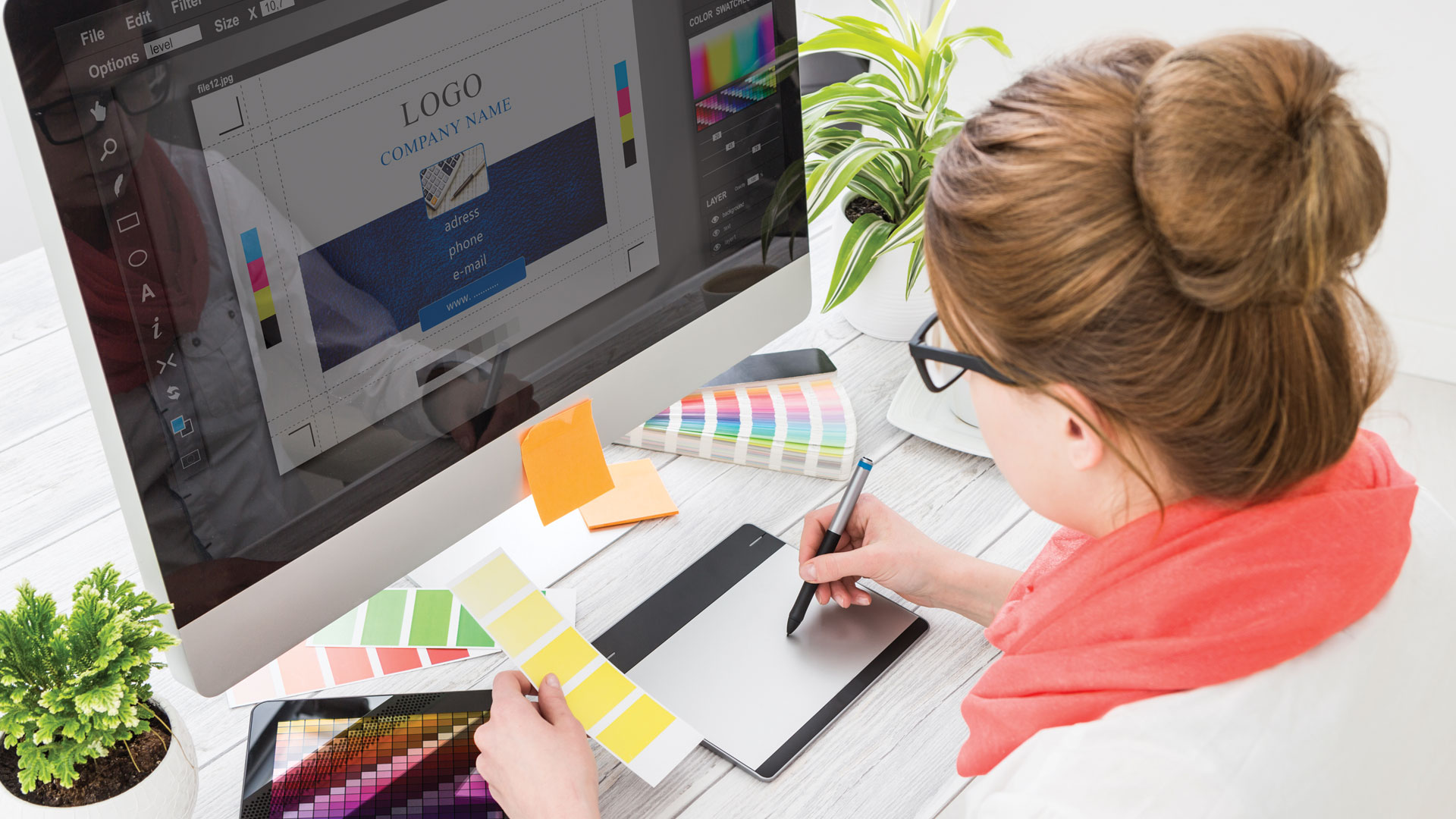
A Logo is the symbol, the trademark of a company. Before one proceeds with logo design, they should become familiar and understand the philosophy and goals of the company. This is the fundamental objective.
A lot of articles have been written about what is important to take into account while creating a company logo.
How important that it should represent the company. The number 1 priority of every company’s logo is that it represent with its image, color, shape and tagline, the values and personality of the company.
Furthermore, it should not only represent the company during the present time but also in the future. As such a logo needs to be unique and timeless. The logo should be suitable for the company, when it is still small, but also when it becomes successful with established repute; it should communicate not only with small crowds, but with all the world. To the degree that this is possible given that nothing lasts forever, and at some point in time, there may be a need for a logo to be tweaked, developed or changed
The many and possible applications of a logo must be considered during the design phase. So a logo needs to be flexible; it needs to be applied correctly on letterhead or webpage, on a white or black background, on a small or large scale, without loss of its strength and brand awareness.
This is the next important element. A successful logo is an instantly recognizable logo. It is crucial for every consumer who sees this symbol in front of them to recognize the company and subconsciously accept the quality of its services or product. From a far-off or close distance, the logo must "yell" with equal strength, what it offers and why someone, chose it over many others and hand over their money to acquire it.
These are the important “Does”. There are, however, some “Don’ts” in logo design.
A logo certainly has to express many things, but not so many so as to confuse the consumer. It does not have to be garrulous or noisy, because it will be interpreted as something rough and disorganized.
Unfortunately, many people when they start their own small business, try to design their company’s logo by just following some general guidelines. In other cases, they call their cousin whose hobby it is to design or they force their children to surf the internet for basic information on how to make a logo themselves. There’s no need to say that in all such cases, even the best endeavours of an amateur will result in a logo that “shouts” “sloppiness, sloppiness, sloppiness”. No company, a small or a big one, would like to advertise such a feature. So for any company that wants to be perceived as a serious business, with a good reputation, has to entrust the design of their logo to the professionals, because simply ... this is their job, which they have studied, and love, and which they do every day and live by it.
Furthermore, a logo is the brand of the company, not the personal emblem of its owner. The owner clearly may have their own opinion, and may possibly want to put up the colors of their favorite team or want a nice picture to show to their friends or prefer a particular fashion. The logo, however, is neither about fashion or personal taste. It's the image of a company that wants to address its audience seriously.
And it is beneficial for any company to know, that even if it is in its infancy - with employee and boss being the same person - that the right logo will give it prestige and size, it will reflect vision that it may not yet have, by "promising" a successful future.
That's why, Do! In your goal to design the future of your company, start by choosing the right team of people with the right experience in the art of creative communication, and talented graphic designers, to design your logo. And believe us when we say, it will be a logo of victory!


